PluseLens Dashboard

Creating a dashboard involves designing an intuitive, user-friendly interface that displays key metrics and data clearly. The process includes understanding user needs, developing wireframes, and ensuring seamless integration with data sources. Key solutions focus on real-time data visualization, easy navigation, and customizable widgets. The primary challenges are maintaining simplicity while providing comprehensive information and ensuring data accuracy. The main takeaway is that a well-designed dashboard enhances decision-making by presenting critical information in a concise, accessible manner.

Role:

Digital Designer

Year:

2023

Role:

Digital Designer

Year:

2023

Role:

Digital Designer

Year:

2023

Role:

Digital Designer

Year:

2023

Behance

App for personal finance consists of two pages "Home and card details"

The Challenge

Data Overload: Presenting large volumes of data in a clear and concise manner.

  1. User Diversity: Catering to users with varying levels of technical expertise and needs.

  2. Clarity and Usability: Ensuring the dashboard is intuitive and easy to navigate.

  3. Real-Time Updates: Providing accurate, up-to-date information.

  4. Customization: Allowing users to customize the dashboard to suit their preferences and needs.

Process

Requirement Gathering:

  • Identify the key metrics and data points users need.

  • Conduct user interviews and surveys to understand their needs and preferences.

  1. Wireframing and Prototyping:

    • Create wireframes and prototypes to visualize the layout and functionality.

    • Iterate based on user feedback and testing.

  2. Design and Development:

    • Design a clean and intuitive UI with a focus on simplicity and usability.

    • Develop the backend to support data integration and real-time updates.

  3. Testing:

    • Conduct usability testing with a diverse group of users.

    • Refine the dashboard based on feedback and identified issues.

  4. Deployment and Training:

    • Deploy the dashboard and provide training or documentation to help users get started.

    • Gather feedback post-launch for continuous improvement.
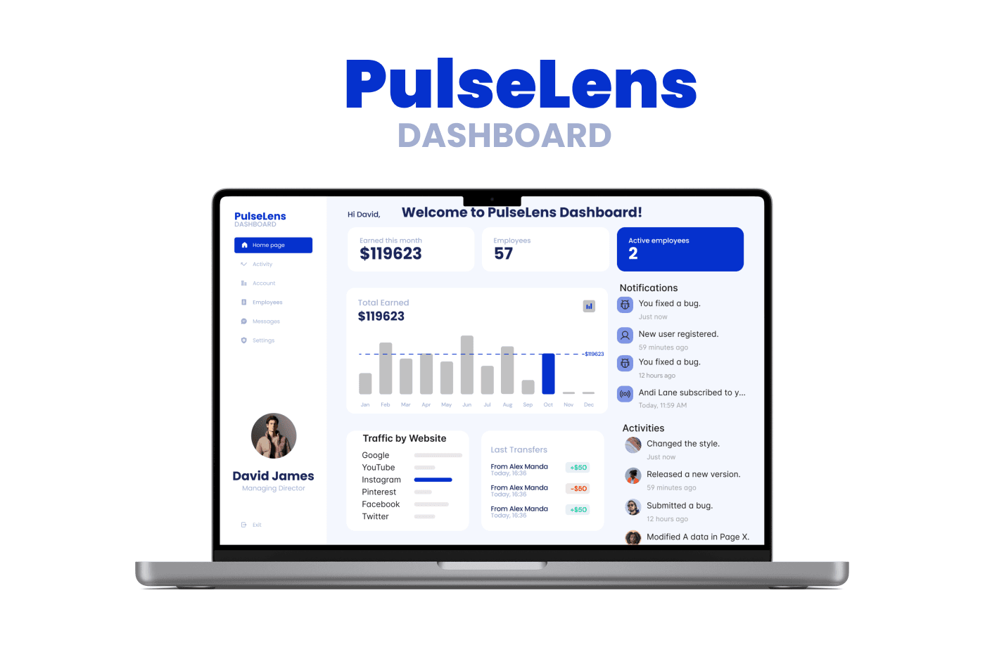
Solution

Minimalist Interface:

  • Clean design with essential information prominently displayed.

  1. Key Metrics:

    • Highlights the most important metrics and data points for quick insights.

  2. Customizable Widgets:

    • Allows users to customize the dashboard with widgets relevant to their needs.

  3. Responsive Design:

    • Optimized for various devices, ensuring usability on desktops, tablets, and smartphones.

  4. Real-Time Data:

    • Integrates real-time data feeds to provide up-to-date information.

  5. User-Friendly Navigation:

    • Intuitive navigation with clear labeling and easy access to different sections.

Key takeaways

User-Centered Design: Understanding and prioritizing user needs and preferences is crucial for a successful dashboard.

  1. Simplicity is Key: A minimalist approach helps in presenting data clearly without overwhelming the user.

  2. Customization Enhances Usability: Allowing users to tailor the dashboard to their specific needs improves engagement and satisfaction.

  3. Continuous Improvement: Regular updates and refinements based on user feedback ensure the dashboard remains relevant and effective.

  4. Responsive and Adaptive: Ensuring the dashboard works seamlessly across different devices enhances accessibility and user experience.